
Dashboard Interview Questions: Build Less, Explain More

bugfree.ai is an advanced AI-powered platform designed to help software engineers master system design and behavioral interviews. Whether you’re preparing for your first interview or aiming to elevate your skills, bugfree.ai provides a robust toolkit tailored to your needs. Key Features:
150+ system design questions: Master challenges across all difficulty levels and problem types, including 30+ object-oriented design and 20+ machine learning design problems. Targeted practice: Sharpen your skills with focused exercises tailored to real-world interview scenarios. In-depth feedback: Get instant, detailed evaluations to refine your approach and level up your solutions. Expert guidance: Dive deep into walkthroughs of all system design solutions like design Twitter, TinyURL, and task schedulers. Learning materials: Access comprehensive guides, cheat sheets, and tutorials to deepen your understanding of system design concepts, from beginner to advanced. AI-powered mock interview: Practice in a realistic interview setting with AI-driven feedback to identify your strengths and areas for improvement.
bugfree.ai goes beyond traditional interview prep tools by combining a vast question library, detailed feedback, and interactive AI simulations. It’s the perfect platform to build confidence, hone your skills, and stand out in today’s competitive job market. Suitable for:
New graduates looking to crack their first system design interview. Experienced engineers seeking advanced practice and fine-tuning of skills. Career changers transitioning into technical roles with a need for structured learning and preparation.
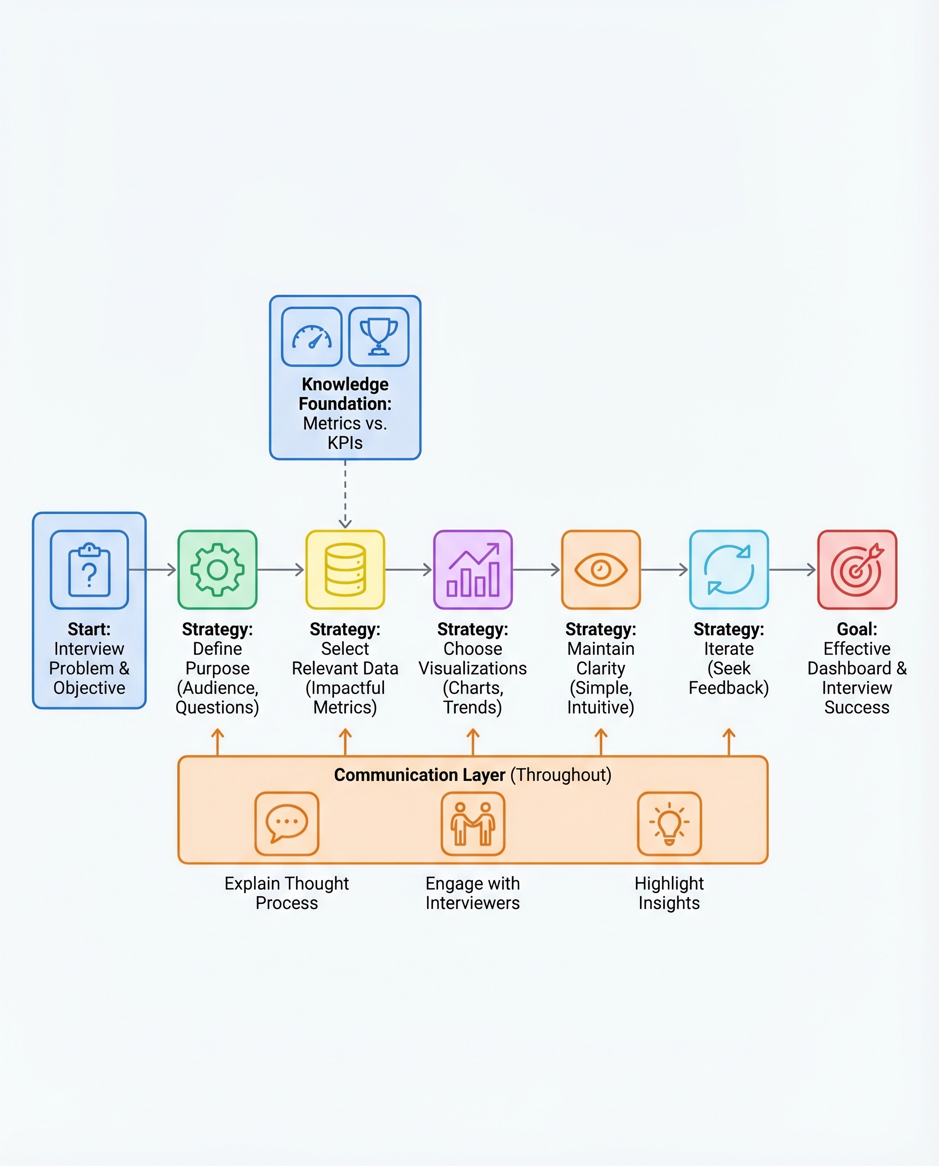
Dashboard Interview Questions: Build Less, Explain More
In dashboard interviews, you’re not being tested on how many charts you can produce — you’re being tested on whether you can drive decisions. Interviewers want to know: can you pick what matters, present it clearly, and explain what to do next?
Below is a concise, practical framework you can use during interviews to build less and explain more.
1) Define the purpose first
- Ask (or state) the core question you're answering: e.g., “Why did revenue drop last month?” or “Which segment should we target to increase conversions?”
- Identify the audience and their tolerance for detail: executive (top-level KPIs), product manager (user flows), analyst (granular metrics).
- Outcome: a one-sentence goal that guides every chart you include.
Example: "Goal: Explain the month-over-month revenue drop to the head of product so they can decide whether to prioritize retention or acquisition."
2) Pick only the metrics that matter
- Start broad, then cut: list candidate metrics, then select the critical subset (KPIs) that directly answer the goal.
- KPIs are the minimum required to make a decision; supporting metrics can be shown if space/time allows.
Typical KPI examples by goal:
- Revenue health: revenue, MRR, churn rate, LTV/CAC
- Acquisition: new users, conversion rate, CPA
- Engagement: DAU/MAU, session length, retention
3) Match visuals to intent
Choose visual types based on what you want the viewer to do with the information:
- Comparison: bar chart (rank products, regions, channels)
- Trend over time: line chart (growth, decline, seasonality)
- Composition: stacked bar or small donut (only for few categories; avoid pies with many slices)
- Distribution: histogram/boxplot (variability, outliers)
- Exact values: table (use sparingly)
Tip: if you want someone to act on a change, show both the metric and a short decomposition that explains the drivers.
4) Keep it simple and readable
- Clear labels and titles that state the insight (not just metric names).
- Minimal color palette (use color to highlight a callout, not decorate).
- Avoid clutter: remove gridlines, redundant legends, and unnecessary axes where possible.
- Accessibility: ensure color contrast and avoid relying on color alone to convey meaning.
Before finishing, ask: "Can the viewer understand the takeaway in 5 seconds?"
5) Iterate and handle feedback gracefully
- Treat interviewer feedback as part of the test: ask clarifying questions, explain trade-offs, and make targeted changes.
- Demonstrate a quick iteration: "If you want more granularity, I’d add a trend by cohort over the last 6 months."
- Show that you can pivot between strategic (high-level) and tactical (drill-down) views.
Most important: narrate your thinking
- Don’t just point at charts — walk through the logic and state the insight and recommended action.
- Use a consistent, short structure when speaking:
- Observation: "We saw a 12% drop in revenue last month."
- Cause (evidence): "Most of the drop came from Region A; conversion fell 18% among new users."
- Recommendation: "I’d prioritize an acquisition funnel audit in Region A and reduce CPA spend until conversion recovers."
Sample narration lines you can use in interviews:
- "The key insight is..."
- "This suggests we should..."
- "If we decide to act, my first experiment would be..."
Quick checklist (to run through before presenting)
- Have I stated the goal and audience?
- Are the metrics a minimal, decisive set?
- Does each visual have a purpose and match the question?
- Can I explain the insight and a clear next step in one sentence?
Keep your build focused and your explanation deliberate. In dashboard interviews, clarity of thought beats chart density every time.
#DataScience #Analytics #InterviewPrep

